Burn Charts – Hours VS Story Points
Burn charts are an incredibly powerful way of tracking progress across an entire project, and a daily within a sprint.
I’ve posted briefly before about project visualisation this way, (Alistair Cockburn/earned value). Today, I’m on about charting progress towards the Sprint goal, as a means of bringing transparency to a team’s real position each day.
The two most popular charts in use by software teams these days, would seem to be a burn down chart of remaining hours or burn down/up of remaining story points.
Both are definitely effective in showing progress, but like so many things agile, circumstances will dictate your preference. Here’s my take on the two.
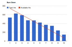
Burn down of hours
When using this type of chart, the team updates the number of hours that they estimate is remaining in the completion of each story in the sprint. The number is totaled and compared daily, to the number of man-hours left before the sprint ends.
Pros
- When done well these charts are a very accurate way of viewing sprint status
- The requirement to estimate the number of hours that will be consumed by a user story (during Sprint planning), can encourage discussion about the real activities involved in the delivery of the story, leading ultimately to a better understanding of story’s reality.
- Regardless of story size, the number of hours in a sprint doesn’t change, and the same goes for remaining hours. This means that progress is visible on incomplete items
Cons
- Hard to do well. For physical storyboards, somebody (usually the scrum Master) must sum all the remaining hours at the same time every day, and physically update the chart. For teams using an online tracking tool, each developer must maintain a vigil over the accuracy of remaining hours, for all the stories they are involved with. Either way, it takes real discipline to keep a burn down of hours accurate and trustworthy.
- Poor estimates make these charts useless. If the initial estimate, or any one (or more) of the subsequent remaining hours estimates is wrong, the chart will have you either cracking champagne, or throwing things at the wall regularly.
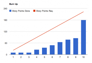
Burn up of story points
This might be a burn down chart as well, and the principal is the same as with hours. The Sprint story point target is compared to the number delivered daily.
Pros
- They are easy to maintain. In fact, teams love updating them. They provide little snippets of gratifying success at regular intervals throughout the sprint (hopefully!), and the chart becomes a natural product of development
- They highlight cadence issues well. Without exception, in my experience, successful teams deliver small pieces of finished code, regularly throughout the sprint. Teams that flounder in the first part of the Sprint, or tend to deliver all value with the “big bang” toward the end, suffer greater quality issues and are less likely to achieve their sprint goals regularly. Watching the number of story points delivered daily highlights this visually.
- They represent finished work, real value
Cons
- They might not work at all! Depending on your teams estimation scale, velocity and development routine, it might be that you don’t see value daily.
- The measurable units (story points) are chunked together, so they turn up all at once for each story. You don’t get to see that an eight-point story is about 90% done say.
Application
I have, and will continue to use both of these types of charts, as well as cumulative flow diagrams (perhaps you’ll see another post on those).
Hours Burn charts work great for teams new to Scrum. My advice is to encourage the team to detail every task involved in delivering a story, estimating the duration of each task. This brings a great level of accuracy to the hours estimated, so long as all of the tasks had been accurately identified!
As each task is completed during a sprint, or new tasks are added to the board, hours are deducted or added. Unfortunately, the summation of points daily can be a drag, especially when many developers are involved, and you must consider this overhead. Unfinished tasks need remaining hours estimated at the time the chart is updated too.
Points burn charts are fantastic for teams that like to put many, many small stories into a sprint. Charts will reflect real progress if the team is looking to complete say, 60 points during a sprint, made up of one, two and three point stories, for example. But if your team is the kind that does three or four bigger stories per sprint (no crime), then it’s likely that items will only be completed few days. These charts provide no visibility to progress in between.
For these reasons, I suggest starting with both, and maintaining the hours burn chart as long as it makes sense. If updating remaining hours estimates gets to be too much for the team, it’s no good forcing them to continue doing that. The chart simply won’t be of any value. The burn up, with its natural and automatic maintenance will work far better for these types of experienced teams. You just have to keep your stories small.


+ There are no comments
Add yours