
Agile Charts (Part 2)
I was on about agile charts, and the importance of making them visual representations of the right measures.
This time (as promised) I’ve put together some example of charts that might be used in Agile teams, to track the things YOU believe are important. I’ve included the measure tracked by the chart in each instance.
The list is not complete. There’ll be interpretations and altogether different charts used by many of you already. Have a read, and I’d love to hear from you, so that I can supplement these examples with some of yours.
Bit of a long post, but stick with it. The gold (what gold there is) is at the bottom.
UPDATE OCT 2012: See Agile Charts (Part 3) – Free templates for all the charts described here!
Classic Agile Charts
The most common and popularly used agile charts are those that track activity during a sprint. Probably the two best known are the “burn up” and “burn down” charts. I’ve heard both of these titles transposed, but let’s use the example of a burned DOWN for hours, and burn UP for story points.
Burn Down
Tracks: Estimated number of hours (effort) remaining to complete the sprint goal.

The hours burn down chart is created every day, immediately after the stand-up meeting. The Scrum Master adds up all of the estimated hours remaining on all incomplete user stories. By plotting these on a chart that also shows the total number of hours available to the team in the remaining days of the Sprint, we can see whether things are on track, ahead or behind schedule. Conversations can then be had about whether or not the sprint goal is realistic.
The main drawback of a burn down on hours is the burden it places on the team to maintain an accurate estimate of remaining effort. This needs to be kept up-to-date everyday, and requires some genuine contemplation. If the team does not feel that this chart provides them value personally, somebody is going to be badgering team members to keep up their estimates, and this can be a drag.
Luckily, the burn down has genuine value to the team (besides that of external reporting), because it can allow them to “fail early” in a sprint, and respond to the change. It’s much better to have that discovery out in the open early. Stakeholders then have the chance to contribute to a discussion about new priorities. That’s much better than sailing along and reporting a disappointing sprint failure at iteration’s end.
Burn up
Tracks: Story points completed daily, throughout a sprint.

Some teams make a burn down of story points remaining to be completed, not hours. For differentiation, we’re going to call that type of chart a burn “UP”.
It’s very similar to the burn down, but rather than tracking work still to be done, it tracks work that has been completed. In the example above, we can see the accumulation of user story points throughout the course of a sprint.
I find the best use of this chart, is to help teams understand the value of low cycle times. Teams new to agile practices tend to view feature delivery in larger chunks. Commonly, such teams will habitually chip away at various parts of the Sprint backlog, finally completing and delivering everything in the last day or two.
Needless to say, this behaviour nets inconsistent results and major disappointments as user stories are left behind. Testers are overburdened late in the sprint, and there’s no time for rework or defect repair.
On teams were this is the norm, the burn up chart will look like the archetypal hockey stick, with no delivered value in perhaps the first 90% of the sprint. Stories need to be made smaller and cycle times lowered, so that runs can get onto the board much earlier in the iteration.
The burn up chart shows that consistently delivering smaller increments of usability increases the chances of a successful delivery of the sprint goal. It also lowers stress levels greatly!
Cumulative Flow
Tracks: Efficiency through stages in the delivery process

Any workflow is only as efficient as its slowest required action. The cumulative flow diagram highlights workflow bottlenecks, by charting the progress of stories through each stage of the sprint. The coloured bands each represent one stage in the development workflow.
In a true “pull” system, a widening of any of these coloured bands over time will indicate a bottleneck in the phase that follows it. It could in practice though (when used in Scrum), indicate a lag in the phase itself.
Cycle charts
Cycle time is a very underplayed concept in scrum. Kanban teams are more likely to grasp the concept, but where you can manage it, reducing cycle times (with improved processes, smaller stories and limiting work in progress) significantly improves the teams run rate.
The cycle time of a user story or feature is the time it takes to make it through your delivery process. The start and finish points are up to you (for example, we currently like to track the time between the status of “development in progress” and “awaiting acceptance”), as long as it’s consistent and recordable.
Cycle History Chart
Tracks: The cycle time of each user story over time.

This is simply the plotting of the cycle time for each story completed. Over time, you may see trends emerge. Dots that are consistently grouped together near the bottom of the chart are good (provided that you think your velocity is where it ought to be). That shows that work is getting through your system quickly.
Spectral Analysis Chart
Tracks: The spectrum of cycle times across all your stories.

From manufacturing to banking, consistency is the hallmark of an efficient and improvable process. If all your user stories were exactly the same “size” (for example), it’d be easier for you to predict the delivery date of each one.
Knowing the most common cycle time of user stories you’ve completed can help you to become more consistent, as well as providing targets (“our most common cycle time for the last year is 6 days, let’s make it 5 days this time next year”).
We can see on the chart here, that a 5 day cycle time is most common for this project.
Variance from Project Average
Tracks: How close each user story’s cycle time is to the average for your team

This is another great chart if you value consistency from your team. The line the centre is the average cycle time across all stories. The dots that surround it show how much variance from that average occurs over time.
Decide for yourself the value of monitoring and charting cycle time. I like to do it, but I’ve found that it can (at times) tell you things that you probably already know. For example, if you load up your iteration with small interface tweaks, then you’ll probably get low cycle times. Dedicate your sprint to some heavy lifting re-factoring, well…
Why Track Cycle Time?
The reason I like cycle time tracking is its ability to lend some pretty nifty support relative size estimation and vigilant backlog maintenance; two of the keys to Scrum success. Read on to see what I mean . . . .
Project charts
So far, we’ve covered charts that pretty much explain the difference between agile projects and traditional waterfall ones. Flexibility within small segments of the project timeline (sprints) doesn’t really factor in “big, up front” planning.
Businesses, sponsors and customers still crave assurance though. Charting can help bring some comfort to onlookers when “embrace the uncertainty” isn’t going to cut it!
Bug Report/Response Tracker
Tracks: Confirmed and Fixed bugs over time, revealing team attitude to bug eradication.
![]()
How’s your quality? Do you trust your QA and feedback loops to be identifying bugs? Do you welcome those bugs with open arms, and record them for fixing? If the answers are yes, then how are you dealing with known bugs? Are you committed to fixing them first? Even at thje cost of percieved feature “progress”?
A bug tracking chart will help you monitor the count of bugs recorded and fixed during your iterations, clearly showing trends in bug confirmations, bug fixes and known bugs recorded in your backlog. It’ll help communicate the importance of an ongoing commitment to quality within the team and outside too.
On this example, the RED line shows bugs ADDED in each sprint. The BLUE line shows bugs FIXED in each sprint. The story is in the difference. If the gap between the red and blue lines keeps widening, it won’t be long until you’re quality issues get away from you. That gap represents the number of outstanding bugs at any moment in the project timeline. It’s also shown at the bottom of the chart in YELLOW. A rising yellow area means that the known bugs are mounting up faster than they are being fixed.
Story size on Cycle time
Tracks: The number of days that user stories (of various sizes) take to get through the delivery process.

I wrote a post a while back on comparative size estimation. Tightknit teams can provide valuable estimates very quickly, if they are able to break the mindset of attempting to correlate story points with days/hours.
On this chart, each bubble is a completed user story. This team uses just three sizes, small, medium and large. Each bubble therefore, can be one of three sizes (a small bubble indicates a small story etc.) The position of the bubble on the chart shows the cycle time for that particular story. The higher up the chart, the longer that story took to complete.
A brilliant team with a perfect crystal ball would produce a chart where all the large bubbles were at the top of the chart, and all the small bubbles were at the bottom, displaying a consistently accurate relationship between size estimation and cycle time.
However, whilst this is generally true, there are frequent exceptions. Sometimes a large story is done very quickly, and sometimes a small story ends up taking much longer than expected.
And yet, this team has a very consistent velocity.
This supports the notion that estimating quickly is an effective way of chopping out unnecessarily verbose and traditional planning sessions. The team knows deep down roughly how big a feature is. So get it out of them, get it on the card, get on with your day!
The details will come, and we’ll learn as we go. What we lose on the swings we’ll gain back on the roundabouts, and over time we’ll get a good line on what’s possible by when.
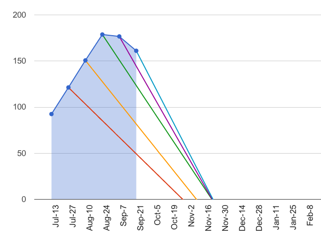
Velocity and Backlog (Forecasting chart)
Tracks: Project work still to do, story point burn rate and estimated project completion date.
Finally, my favourite chart.
Most teams track velocity of course, for the purpose of future planning. This chart goes further.
Simplistically, deriving an estimated project completion date is of course a matter of dividing the story point size of the project backlog, by the team’s known velocity. 100 points in the backlog will probably be consumed in 5 iterations by a team whose velocity is 20. Not an exact science, but the idea pretty much underpins agile project planning.
Of course, one of the greatest threats to a project’s success is scope creep. If you are involved in iteration planning, you need a way to illustrate scope creep as an issue, or you WILL be forced to defend the next most obvious scapegoat; team performance!
The grey bars on the chart above are the team’s velocity. See it grow over the first few iterations, as the team finds its feet. The red area shows the known and estimated backlog, current at the beginning of each sprint. This is the known scope. See how it too grows over the first few iterations.
As long as the scope continues to grow ahead of the team’s capacity to consume story points, the project will never be done!
Here’s the best bit though. The angled lines descending from the known scope points fall upon an estimated completion date. This calculation is made by averaging velocity over the previous 2 iterations (yesterday’s weather), and dividing the known scope by that burn rate.
Importantly, the input for this chart also allows the iteration planner to make an assessment of how much how much of the backlog is currently known and estimated (50%?, 90%?). The chart then takes this into account for its projection.
This chart is a powerful reporting tool. Scope creep is plain for all to see, indicated by a rise or a levelling off of the red segment. If stuff is being added faster, or as fast as it can be done, the delivery date will continuously be recalculated, further and further into the future.
Where to from here?
I’d love to hear from people with suggestions on these charts, and examples of some others. The charts you see here are google spreadsheets, so I’ll see about splitting them off into some shareable versions that you can use/customize for your own teams.
(UPDATE OCT 2012: See Agile Charts (Part 3) – Free templates for all the charts described here!)
There are other charting examples that I know are not covered here. Here are some links to other sites that I enjoyed reading, covering other charts and their value:
Earned Value
These charts in part inspired my forecasting chart. Both of these blogs are worth following.
http://www.agilekiwi.com/earnedvalue/agile-charts/
http://alistair.cockburn.us/Earned-value+and+burn+charts
Parking Lot Diagrams
Can help visualize overall project completion. Mike Griffiths is a great agile project thinker.
http://leadinganswers.typepad.com/leading_answers/2009/12/parking-lot-diagrams-revisited-using-area-to-show-effort.html
[…] Part 2 of this post will focus on Agile measures, and the charts we can use to monitor and improve them. […]
http://lostechies.com/jimmybogard/2012/09/12/why-im-done-with-scrum/
Read your post on leaving Scrum Jimmy. I’ve heard similar statements from developers before, and I agree with all the points you make. The thing is, if you have wasteful, painful iteration planning meetings, and if you are not focused on delivering value quickly (well, not YOU specifically, but teams . . . you know what I mean), it’s not Scrum that’s broken. You’re doing it wrong. Scrum aims to solve the same things that seem to frustrate you when using it. I see the iteration (done well) as a pull system, and limiting work in progress through phases within the sprint works great. On the project side, the iteration is a good planning and external communication tool. I hear you though. Bad Scrum without energy can be as bad as your death march. Scrum or not, you and your team have grasped control of your own processes and own them, with a focus on productivity and quality. Ultimately, that’s the most important thing.